Remarkably Us
The goal of this redesign was to create a more engaging website for the non-profit, highlighting many pieces of the significant work they do in the community. We incorporated visual hierarchy and vibrant, eye-catching colors to add a dynamic and approachable feel to the design.

Background of Project: This was a team of two UX/UI Designers, an SEO team member, and a content writer. We created this responsive redesign as volunteers with 48in48. Which consisted of the rework to be done in 48 hours using WordPress, Figma, and Slack.
Collaborating with Stakeholder to Align Design
Through open communication, active listening, and iterating feedback continuously through the design process. We worked with the stakeholders to understand the needs, priorities, and goals. This process ensured that the final design reached the users expectations, but also effectively represented the stakeholders mission, and values.
Mission Statement—We cultivate community by amplifying the narratives and empowering the unrepresented voices of Latinas in the foster care system through networking, skill development, and transformative experiences. Our aim is to reshape trajectories, inspire fellow Latinas in foster care, defy discouraging statistics, and triumph over the paralyzing effects of toxic shame.
Vission Statement- We invision a world where Latinas including current youth and adults in the foster care system, as well as former foster care Latinas leading professional lives, experience a profound sense of connection, care, and our inspired to pursue their goals. Simutanesouly we aim to uplift their remarkable stories and catalyze profound change through their distinctive impact.
Design Process…
These photos were examples of the style and colors the stakeholder wanted us to align with in the design of the website

Colorography


Their input guided the creation of a vibrant color scheme that reflected the organization’s personality.


Typography
Visual Hierarchy
Added this hero section to grab attention and convey the primary purpose or message of the page.
Next, we wanted to add the website’s mission and vision to build user’s connection to the non-profit work.
Showing the impact this non-profit has made builds trust with the users.
#307B45
#E59298
#DA6528
#F4DB41
Discussing the font styles that blended with the clients vision for their website were bold, and vintage styles. So as a team we concluded on…
Highlighting the non-profit's purpose was key to crafting a compelling narrative that conveyed the client's vision for their website. By leveraging visual hierarchy, We ensured the mission and impact took center stage, creating a design that resonated with their audience.
Example: demonstrated through the home pages wireframes LO-FI


H1- Goudy Bookletter 1911 serif
Font Size 36pt
Body- Poppins sans-serif
Font Size 16pt

Team Structure

Working together with WordPress, we translated our wireframe designs into fully functional pages, ensuring each one had a clear context and provided a seamless, user-friendly experience. Also integrated SEO best practices into the website and fine-tuned every page to align with the client's specific needs and goals
Homepage Before Design

With only 48 hours to create a new design for Remarkably Us we had a team that consistently met up with our client. Beforehand to discuss the materials our project manager cumulated together.
From there the work was broken into our expertise. The content writer and I the UX/UI designer worked to take the materials given. Display them that demonstrated the impact, and message our client wanted to show to build trust with users.
Homepage After Design


About Page

News Page
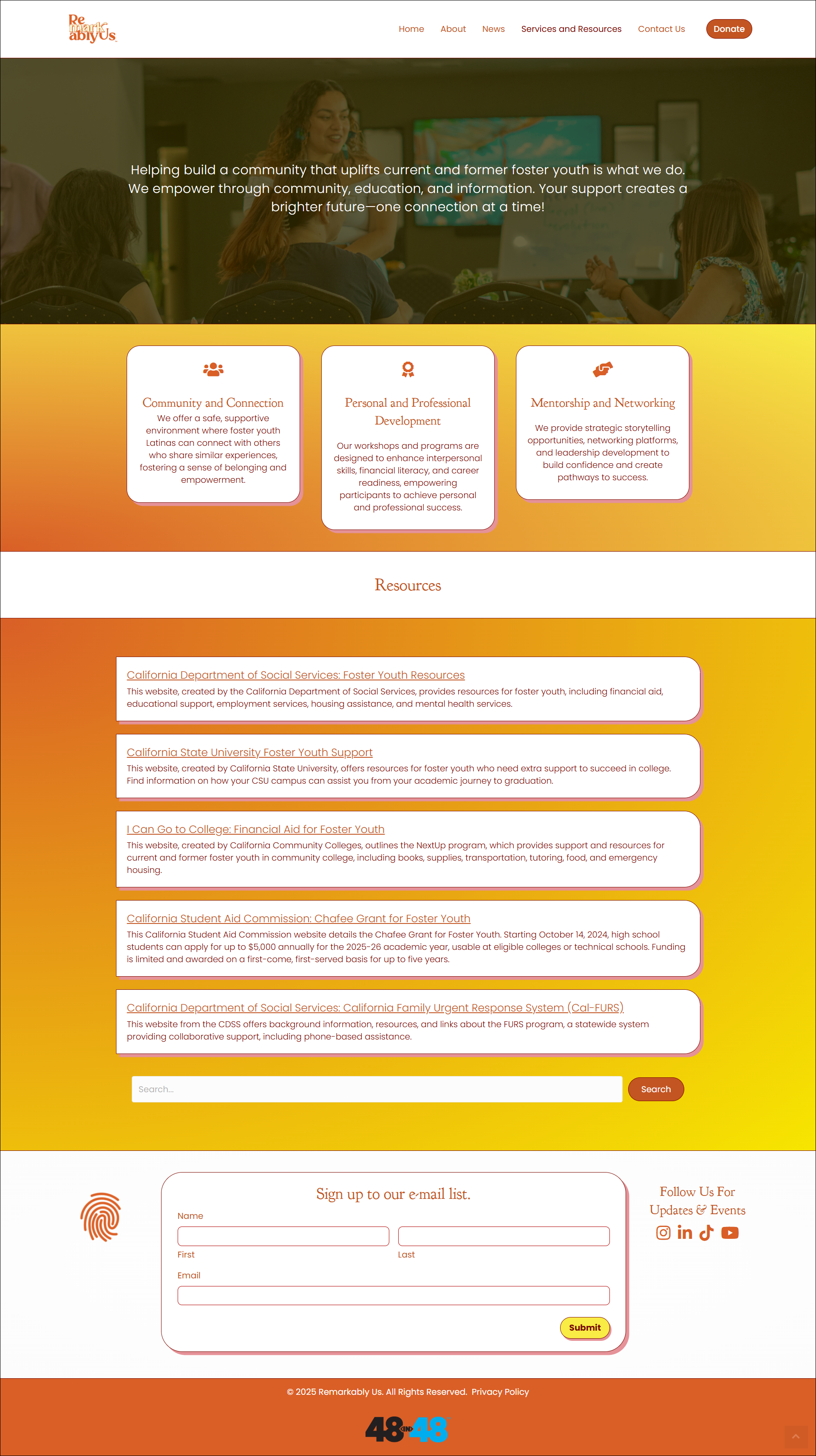
Service and Resource Page

Contact Page
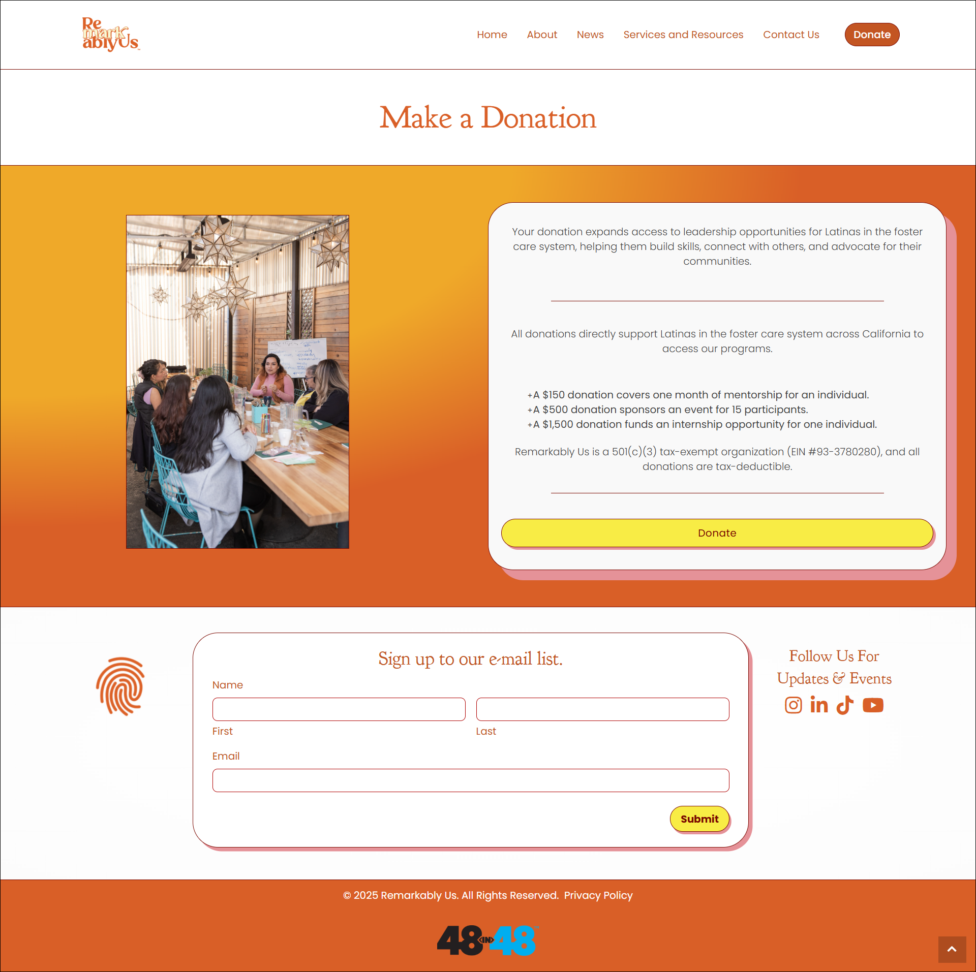
Donation Page